Pukka Berlin
Shopify development and storefront improvements for a German jewellery brand.
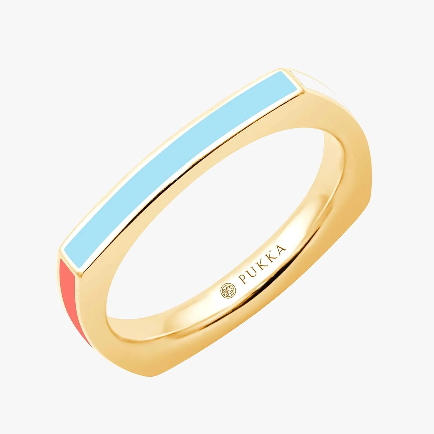
I paid attention to the decisions made before buying a ring: material, size and color.
- Field
- Jewelry / Germany
- Built with
- Shopify
The challenge
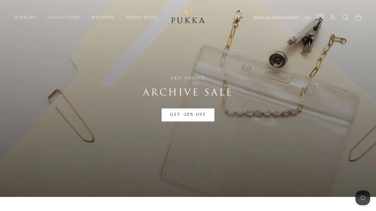
Pukka Berlin needed a Shopify store that gave its jewellery room to be seen and made the practical parts of shopping clear. Visitors might arrive looking for a particular ring, browse a collection or start with a photograph. Each route needed to lead to a product page without making people hunt for the next step.
The approach
I developed and refined the Shopify storefront around the brand’s catalogue. My work covered collection and product experiences and responsive layouts. I paid attention to the connection between the visual presentation and the decisions a shopper makes before adding an item to the cart. The pages below show the public store today. They help explain the product context, but the site may have changed since my delivery.
The collection up close
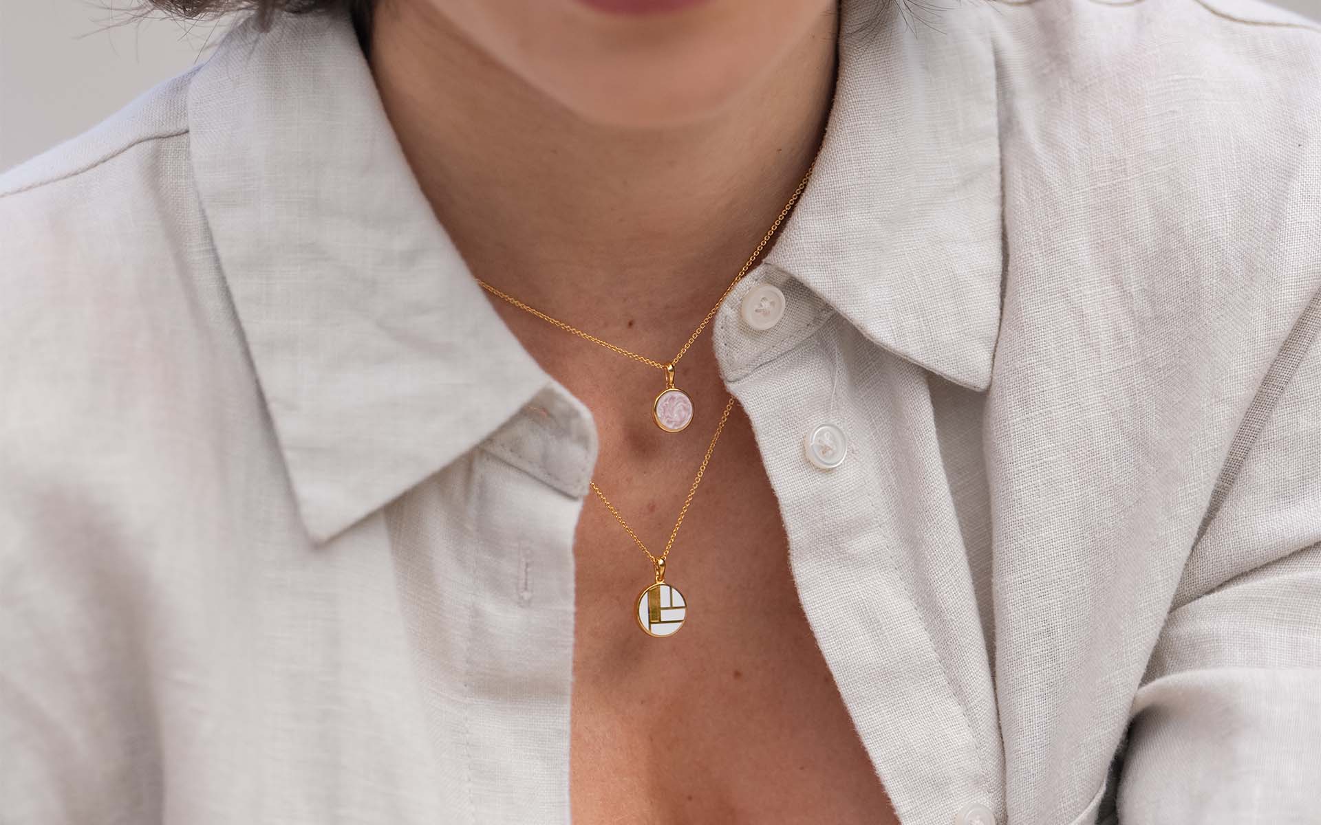
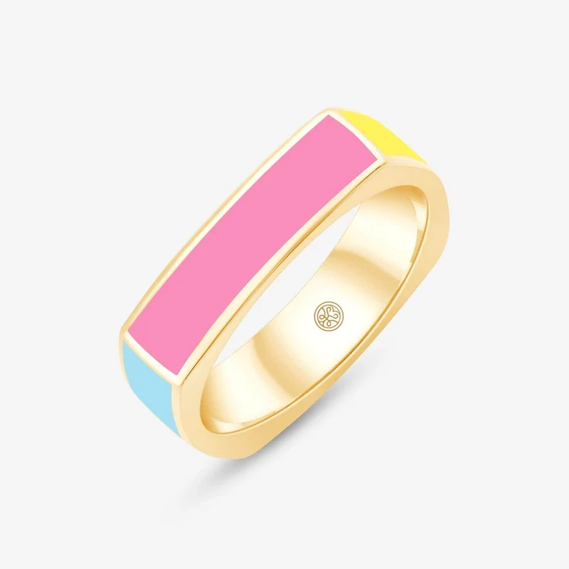
Product and editorial photography from Pukka Berlin’s public shop. The brand’s images show the jewellery behind my Shopify work.
The project, in detail
Real browser captures of the English storefront, October 2026. They show the shop today; the theme and content may have changed since my work.
A route through the collection
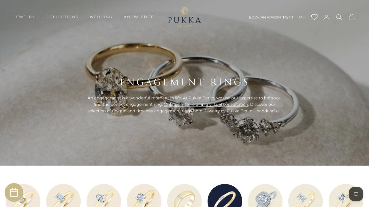
I worked on the transition from browsing collections to looking at individual pieces. A jewellery catalogue needs clear product names and a consistent way to move between pages, alongside the photography. The current engagement collection shows that journey through an editorial opening and a filtered grid. These are two views of the same public page.

Room for the buying decision
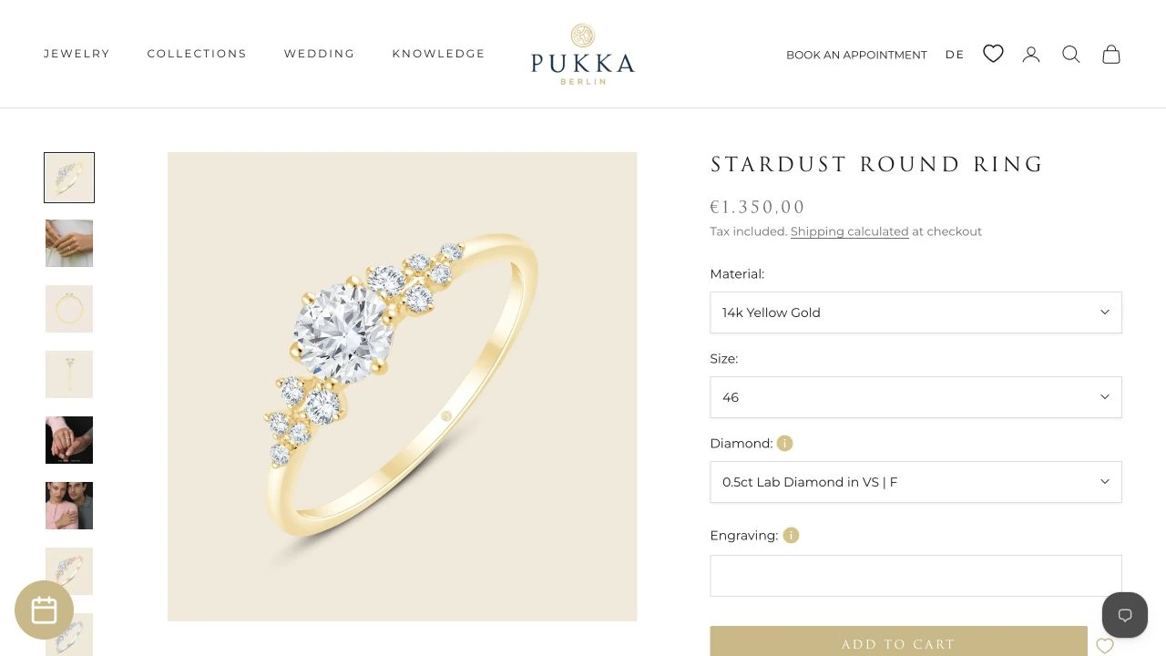
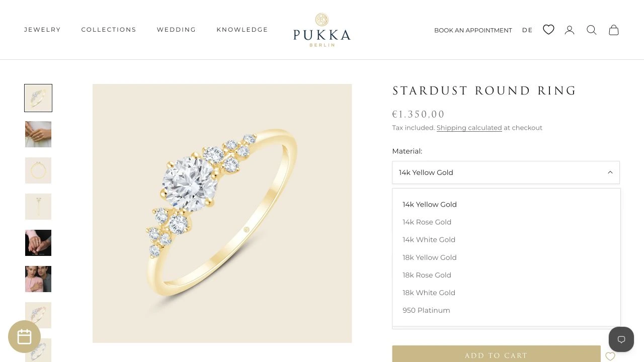
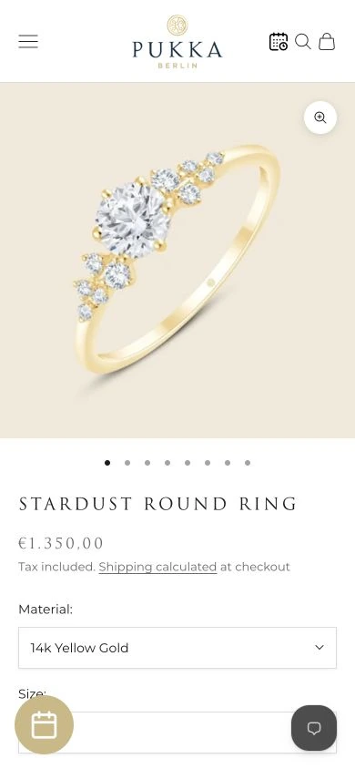
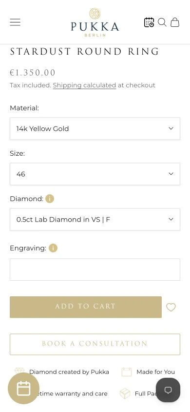
I refined the product experience so photographs and purchase details could sit together. On a ring page, material, size and finish are part of the decision, rather than details to hide at the bottom. The current Stardust page illustrates a more configurable product with diamond and engraving options. The second screen shows the real material selector open.
The brand and the shop together
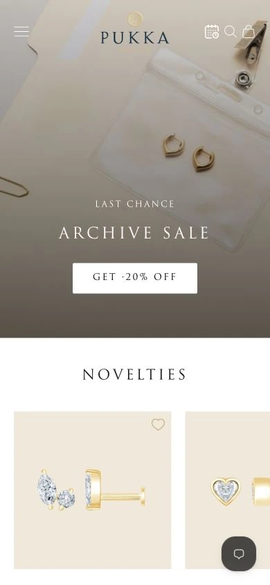
I worked on responsive storefront layouts, where imagery and navigation still needed to make sense on a small screen. The current shop pairs editorial photographs with products and gives the mobile product form its own space below the image. The phone captures further down show the homepage, the product and its purchase controls separately, without shrinking a desktop layout into a phone.
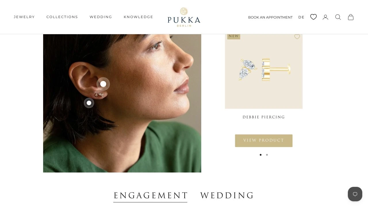
On a smaller screen
Real phone-sized browser captures from October 2026. They show the current site; content and product details may have changed since delivery.
The outcome
A Shopify storefront developed and refined for a German jewellery brand.
Collection browsing, product experiences and responsive layouts.
Current public desktop and mobile views. Product photography belongs to Pukka Berlin.
Details of Pukka Berlin
Which platform did I use for Pukka Berlin?
Shopify. I developed and refined the jewelry store and its route from collections to product choices.
Who created the jewelry photography?
The current photos come from Pukka Berlin's public store. I use them to show the product context; I do not claim to have photographed the pieces or created the brand identity.