ENDEKA
an interior studio’s work given space to speak
I think the interface should step back here: the interior projects and their photography are the reason to visit.
- Field
- Architecture and interiors
- Built with
- WordPress / JavaScript
- Project year
- 2021

The challenge
ENDEKA needed to present interior design and construction work without letting the website’s interface compete with the spaces themselves. Visitors had to move easily from an overview of the studio’s output into the detail of a particular project.
The approach
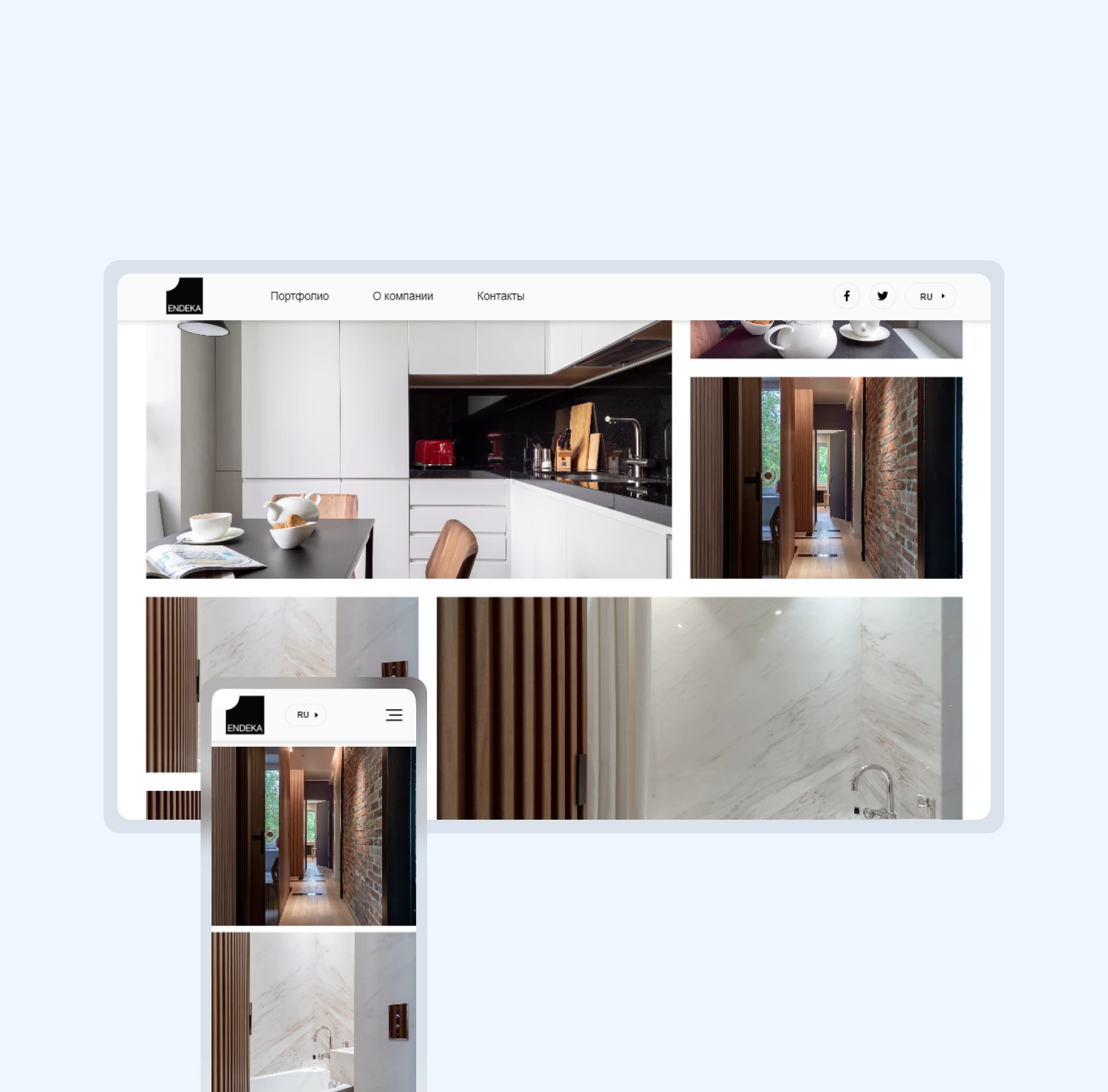
Several visual concepts were explored before the chosen direction became a responsive WordPress website. The system uses simple forms, a limited palette and a strong hierarchy, keeping the studio’s project photography central to the experience.
The project, in detail
The images show the interface and its context. Captions distinguish project archives from current-site views.
An overview and a closer look
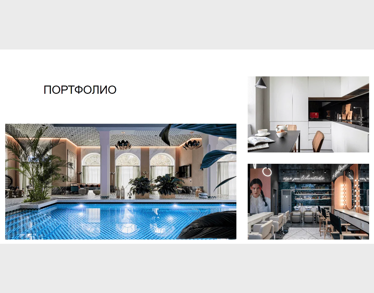
The portfolio catalogue offers a compact way to scan different projects. Individual case pages then provide room for imagery and project detail. The two levels serve different decisions: discovering a relevant kind of work and evaluating its execution.
Contact without a detour
The contact page combines the studio’s details, a feedback form and an interactive map. The same restrained visual system carries through to this practical endpoint, connecting an image-led portfolio with a clear next step for an interested visitor.

The outcome
Responsive WordPress project portfolio
Project detail pages, contact form and interactive map
Details of ENDEKA
What kind of website work was this?
The layout gave interior projects and their photography space, keeping interface elements out of the work's way.